
Plain Carpet With Structure: Velvet and Tip-Sheared in the Hotel Room
When a single colour beats a pattern in a hotel: how velvet and tip-sheared pile take the light, which rooms suit plain carpet, how to approve colour on a physical sample, and when a rug is better than wall-to-wall.
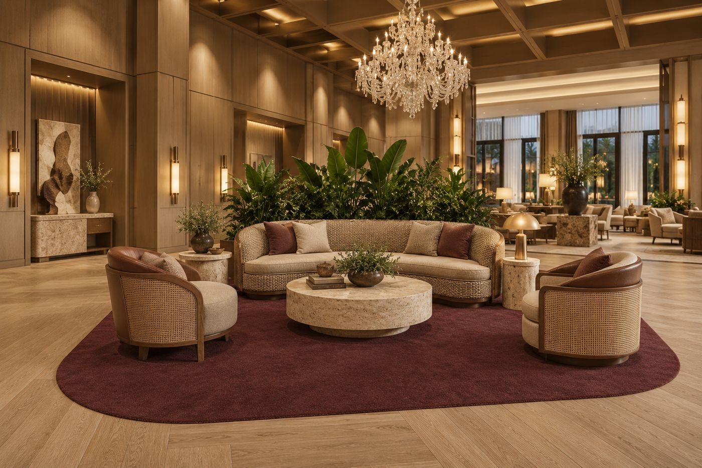
Most carpet briefs start with a pattern. A designer sketches a motif, a colour story follows, and the floor becomes one more graphic element in the room. Sometimes that is exactly right. In other rooms the better answer is the opposite: one colour, no drawing at all, and a surface that does the work by itself.
A plain carpet is not an empty carpet. With no motif to look at, the eye reads the pile: how deep it is, which way it leans, how it catches a window. This piece looks at the two textures ligea makes for plain floors, where a single colour is the right call in a hotel, and how to specify one so that the sample on the desk and the floor in the room agree.
01Two textures, two ways of taking light
Our plain range has two textures today, with more in development. Both are made to measure, as a rug or as fitted carpet, hand-tufted or hand-woven, in any colour from your scheme.
Velvet is a dense, even cut pile with a deep, soft sheen. Light behaves differently depending on which way the pile leans. Where it leans away from the light, the surface glows; where it leans towards you, it reads darker. The effect is that the floor shades gently as you walk across it. It is worth looking at a velvet sample from more than one side.
Tip-sheared is a silky pile sheared at the tips. From across the room it reads as a calm, cloudy lustre with a fine grain running along the length of the carpet, lighter towards the light and richer away from it. Where velvet is a surface of sheen, tip-sheared is a surface of grain, and the grain gives the floor a visible but quiet structure.
Neither is better. They answer different rooms and moods, and a scheme can use both: velvet in the suite, tip-sheared in the bar, one colour story running through.
02Where a single colour is the right answer
A pattern earns its place by doing a job: hiding a seam, adding energy to a public room, giving a standard room character. Where none of those jobs is needed, a plain surface is the more honest choice.
The clearest case is the calm room. The ligea trend report for 2027 looked at 370 hotels and hotel projects. Upscale hotels, it found, keep the guest room calm and put the pattern in the lobby and the bar, and only the quiet luxury look keeps the floor mostly plain. Texture belongs where the room is calm: in the guest room and in quiet, timber-led interiors.
Three situations come up repeatedly in specification work.
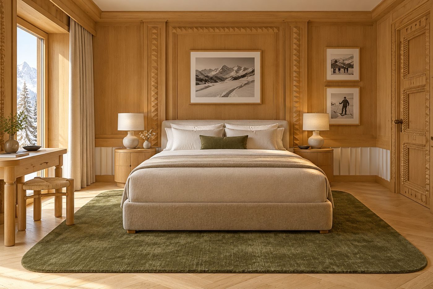
The guest room as a restful space. A rug under the bed in one colour, with enough texture to feel considered, lets the bedding, the headboard and the view lead. The floor stays in the background and still feels made.
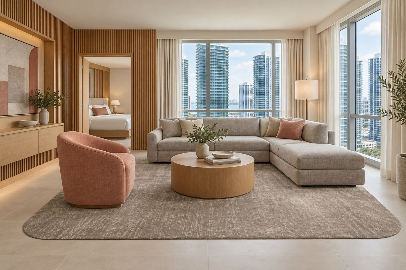
The suite living area. A sofa group on a plain rug lets the furniture carry the pattern and the colour. If the upholstery is already busy or strongly shaped, a second drawing underneath competes with it.
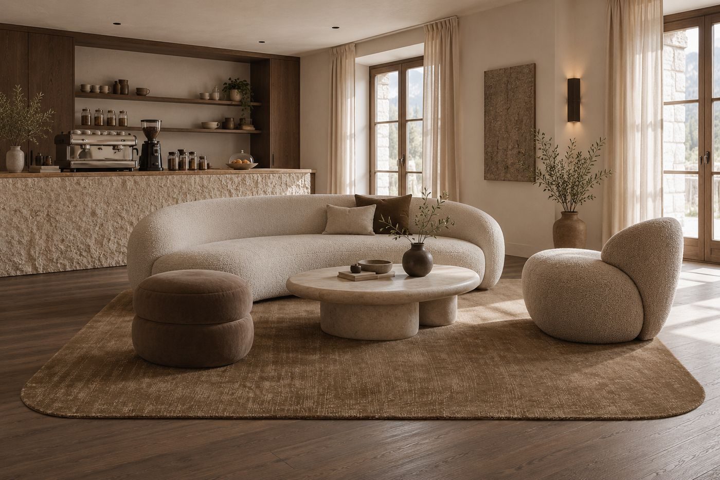
The bar and the lounge. Dark rooms are back, according to the same report, led by the bar. A plain rug in a deep colour grounds a seating group in a dark interior without adding visual noise to metal, glass and warm lighting.
Where a plain floor is the wrong answer is just as clear. Ballrooms, meeting rooms and corridors are wall-to-wall carpet territory, and almost all of that carpet is patterned, because a large, free repeat hides seams, traffic lanes and changing furniture layouts. A single colour hides none of that. Plain carpet belongs in the rooms where you want to see the floor, not in the rooms where the floor has to forgive.
03Choosing the colour
With no pattern to carry the design, colour does everything, and it is worth being careful with it. Our plain samples are shown in a range that runs from pale neutrals such as Ecru, Stone and Mushroom through Sage, Moss and Olive to Cognac, Rust, Oxblood, Slate and Ink. These are examples, not a palette box: any colour from your scheme can be made, and a special colour costs nothing extra.
The trend report is useful for orientation. The calm base underfoot stays sand, taupe and warm brown, while olive, sage and bottle green appear on walls and velvet but rarely reach the floor. Terracotta and rust work best as a mid-tone ground rather than an accent line, and a plain rug is the cleanest way to try that, because the colour is the whole design.
One caution applies to every plain carpet. A pile that shades with the light will never look identical to a flat colour chip. The same colour reads differently in a bright suite than in an interior bar. So the colour should be approved on a physical sample, in the room or under the room's light, and viewed from the angle a guest will actually see it. We match every colour to a physical pom and approve a strike-off before production. For the wider discussion of references such as Pantone TCX, NCS and RAL, see our guide to carpet colour matching.
04Rug or wall-to-wall
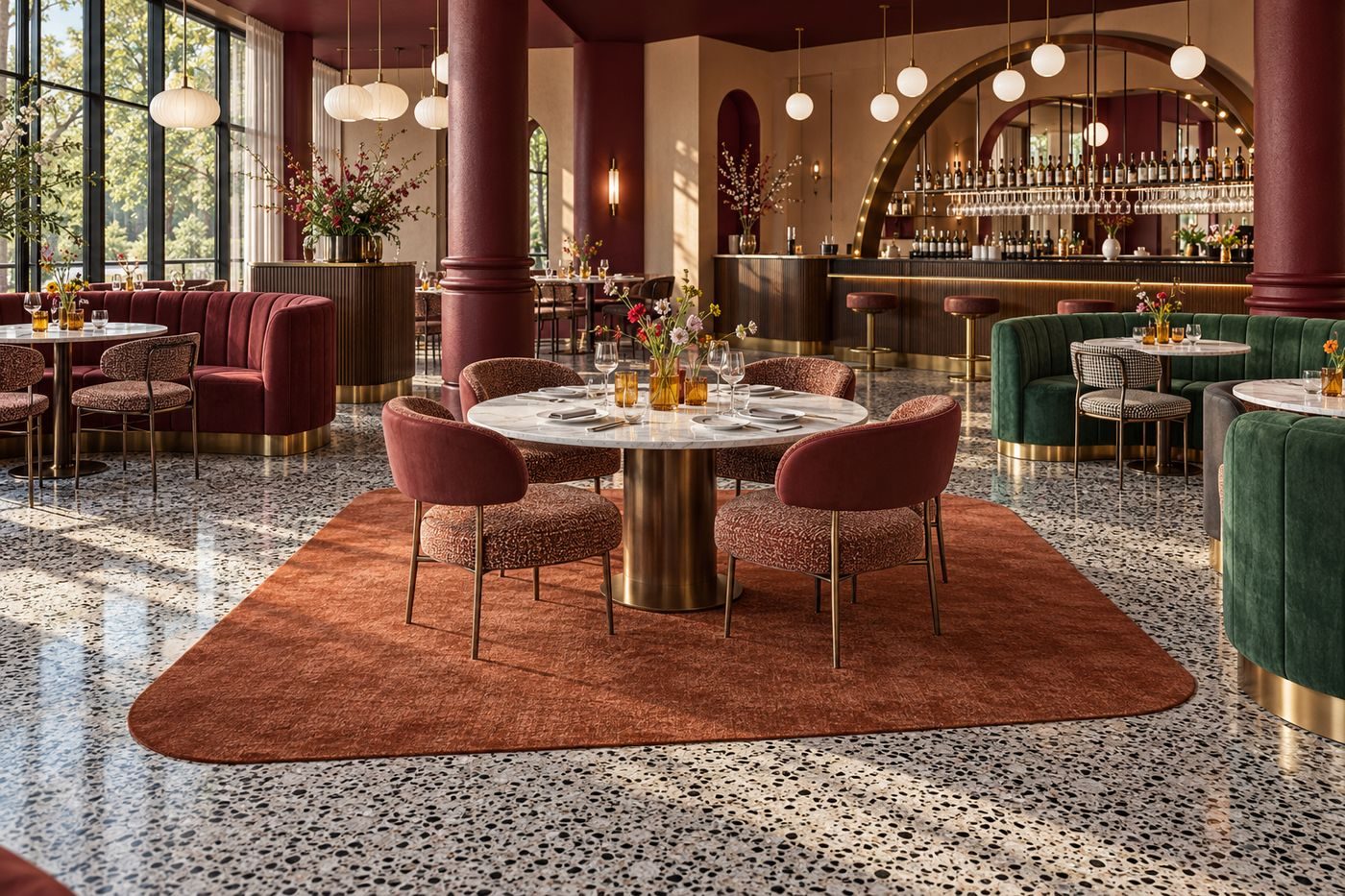
The trend report puts a number on the current habit: where the floor can be seen, a rug on wood, stone or terrazzo is about four times as common as wall-to-wall carpet. About four in five lobbies and lounges have one. For plain carpet this fits well. A rug lets the texture sit against a hard floor, and the contrast with the hard floor shows the pile off.
A rug also gives you a choice of outline. Hotel furniture is getting rounder, and a rug with sharp corners sits against it. The ligea shape library offers rounded corners at three radii, a stadium, an oval, a circle and three free-form pebble shapes, all at no extra cost and in every production method. The radius is calculated from the shorter side of the rug, so a small rug does not turn oval and a large one does not look heavy.
Fitted plain carpet is the better choice where the floor has to be continuous, for example a guest room with no hard-floor border. A rug asks for a good floor underneath it. A fitted carpet asks for a seam plan and a decision about pile direction. If you are weighing the two formats, our comparison of broadloom and carpet tiles covers the fitted side in more detail.
05Hand-tufted or hand-woven
Plain carpet from ligea is made by hand in one of two ways. Hand-tufting is the technique we use for freely shaped, made-to-size pieces, and it draws clean outlines, including the rounded corners and free-form shapes described above. Our article on hand-tufted and machine-woven carpet explains the construction in detail. Hand-woven is the second route we offer for plain carpet.
Name your preference early and confirm it on a physical sample of that construction. If you are unsure, tell us the room and the feel you want, and we will propose the one that fits.
06Where ligea Comes In
We make plain carpet in velvet and tip-sheared, as a rug or as fitted carpet, hand-tufted or hand-woven, in any colour from your scheme. Every library shape is available for rugs, and any other outline on request. Colours are matched to a physical pom, and a strike-off is approved before production, so you judge the surface on the real thing. Send us the room, the area and the direction, and a design proposal and quotation follow within 24 hours. You can see the full range of qualities and the ready-made directions in the collections.
Send your rooms through spec to quote, or book a 15-minute spec call to choose a surface and a colour for your rooms.